
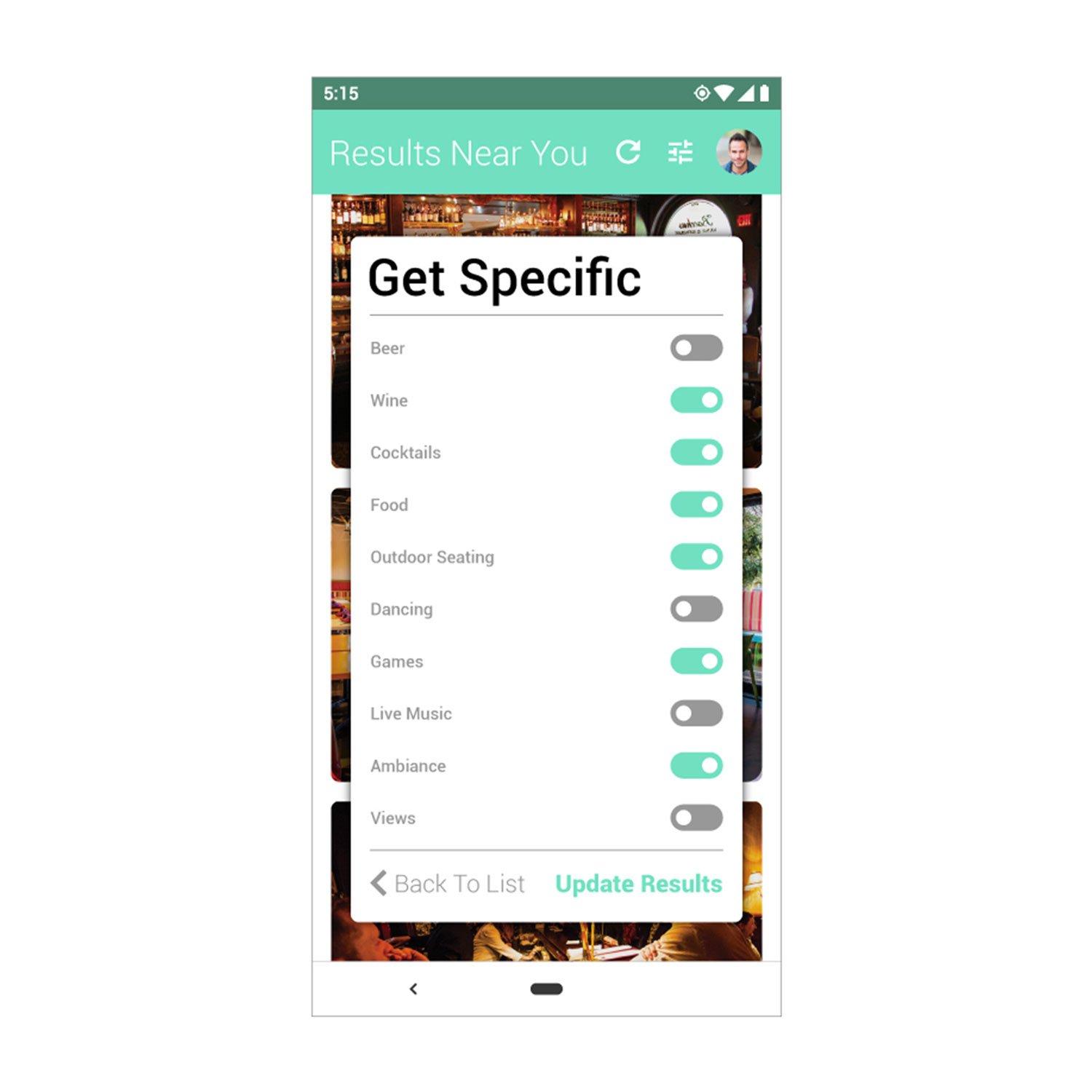
App Interface Design, The Happy Hour Guide
The Happy Hour Guide app was designed for finding local happy hours. I worked with the client who had a basic idea of what they were looking for. Using that information, current best practices and my knowledge of UX/UI, I designed the below mobile application interface.


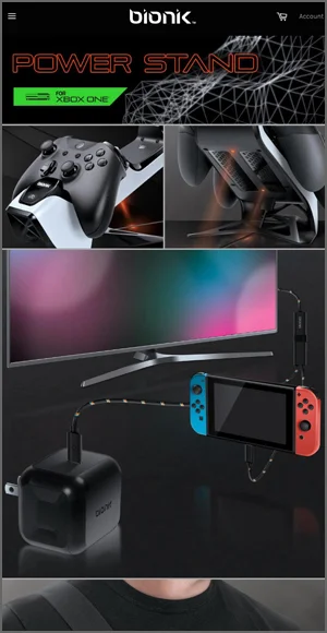
Bionik Website
The online experience for Bionik needed to match the quality of the product as well as compete with the competition. Built on Shopify, the web developer we contracted for this project and I designed the page layouts, made sure to follow best UX/UI practices, ensured clean code and small image sizes for fast loading times.
Equally as important as an immersive desktop experience was the website on mobile devices. Checking the site's layout at multiple sizes and making adjustments, ensures the site looks fantastic on any laptop, iPad, smartphone or 4k screen.
Desktop Design

Home page design featuring a redesigned carousel and featured products. All elements are responsive completely custom.

Interactive home page element. Hovering over different parts of the image reveal popups that highlight key features.
Mobile Design
Mobile version of the home page. Carousel has mobile specific layout and featured products are stacked for optimal visibility on mobile.

Mobile menu design. Hamburger menu slides out from the left revealing menu categories and drop down menus for each product.

Product page design. Images have thumbnail slideshow below for easy navigation. Product video and description are laid out underneath to maximize user flow and experience.

Simple information page illustrating how the site scales from desktop to mobile including the footer navigation content.

LaBu Website
The online experience was designed to convey high quality with beautiful materiality. LaBu's commitment to 100% natural products, their inspiration, and desire for a healthy planet through philanthropy was a message that needed to be obvious to the customer. Built on the Big Commerce platform, the web developer we contracted for this project and I designed the page layouts, made sure to follow best UX/UI practices and ensured clean code and small image sizes for fast loading times.
Equally as important as an immersive desktop experience was the website on mobile devices. Although users primarily purchased on desktops, the mobile site still needed to be flawless and beautiful. Checking the site's layout at multiple sizes and making adjustments, ensures the site looks fantastic on any laptop, iPad, smartphone or 4k screen.

My Arcade Website
The online experience for My Arcade needed to match the fun nd excitement of the products. Built on Shopify, the web developer we contracted for this project and I designed the page layouts, made sure to follow best UX/UI practices, ensured clean code and small image sizes for fast loading times. Took great care to make sure the site gave adequate importance to the products and the brand we were designing the site for.
Equally as important as an immersive desktop experience was the website on mobile devices. Checking the site's layout at multiple sizes and making adjustments, ensures the site looks fantastic on any laptop, iPad, smartphone or 4k screen.
Desktop Design

Desktop home page design featuring a custom parallax carousel.

Home page section highlighting who My Arcade is as a company. Purpose is to connect with customer demographics.
Mobile Design

Home page layout for mobile illustrating how the custom carousel and featured product sections scale down for mobile.

Mobile menu design. Hamburger menu slides out from the left revealing menu categories and drop down menus for each subcategory.

Product page design for mobile. All elements have been stacked in order of importance for optimal experience on mobile.

Simple information page illustrating how the site scales from desktop to mobile including the footer navigation content.

Signal Website
The website is minimalist and utilizes large lifestyle photos moving through the pages in a parallax effect. These are used to tell the product's story before reading any of the copy telling the buyer what the product is, its use applications and unique features. The lifestyle photos coupled with studio shots are edited to be sharp and dynamic help round out the overall product message. Built on Big Commerce, the web developer we contracted for this project and I designed the page layouts, made sure to follow best UX/UI practices and ensured clean code and small image sizes for fast loading times.